Ferris Graphic Design Program Communications
Design Project Center
Senior project
Fall 2017
Designers: Natalie Dixon & Kyle Rice
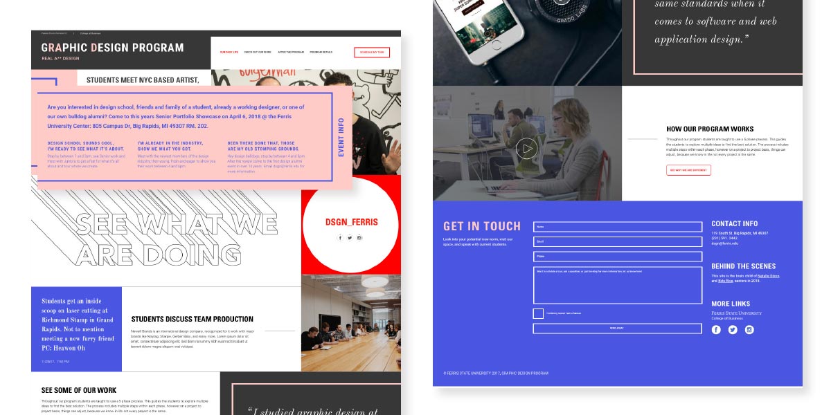
This project focuses on the brand issue for the Design Program at Ferris State University, where design as program in the College of Business isn’t getting the recognition it needs. This has affected the perception of students not being “creative” and lowered the enrollment numbers. Our object was a re-design of the program website to be more updated and fresh, pulling style and colors from studies and trends. We also approached a social media strategy to target younger demographics and boost enrollment.

AUDIENCE: THE DESIGN INDUSTRY
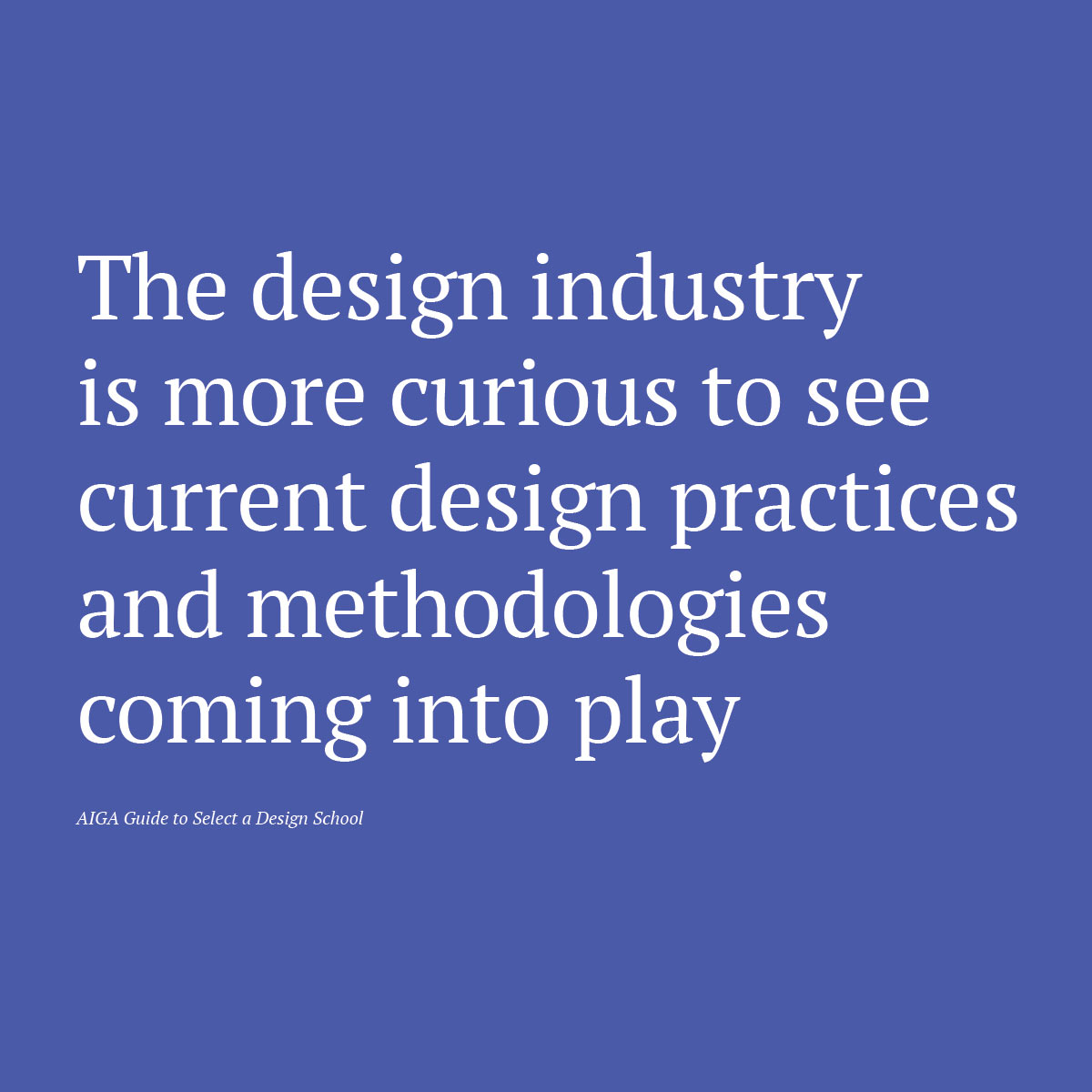
Visibility within the industry is key when recruiting potential students, and currently the design program does not compare to institutions such as the Rhode Island School for Design because it is a relatively new program. Our team conducted extensive research to combat this disadvantage, and bring Ferris on the map for design.

AUDIENCE: PERSPECTIVE STUDENTS
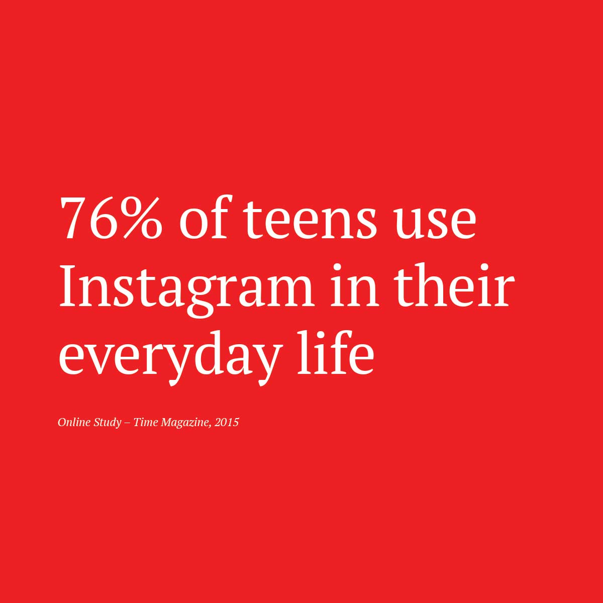
Because social media is such a huge piece of the young culture, our team looked at understanding how to reach these young individuals by using platforms such as instagram, facebook and twitter.

AUDIENCE: PARENTS
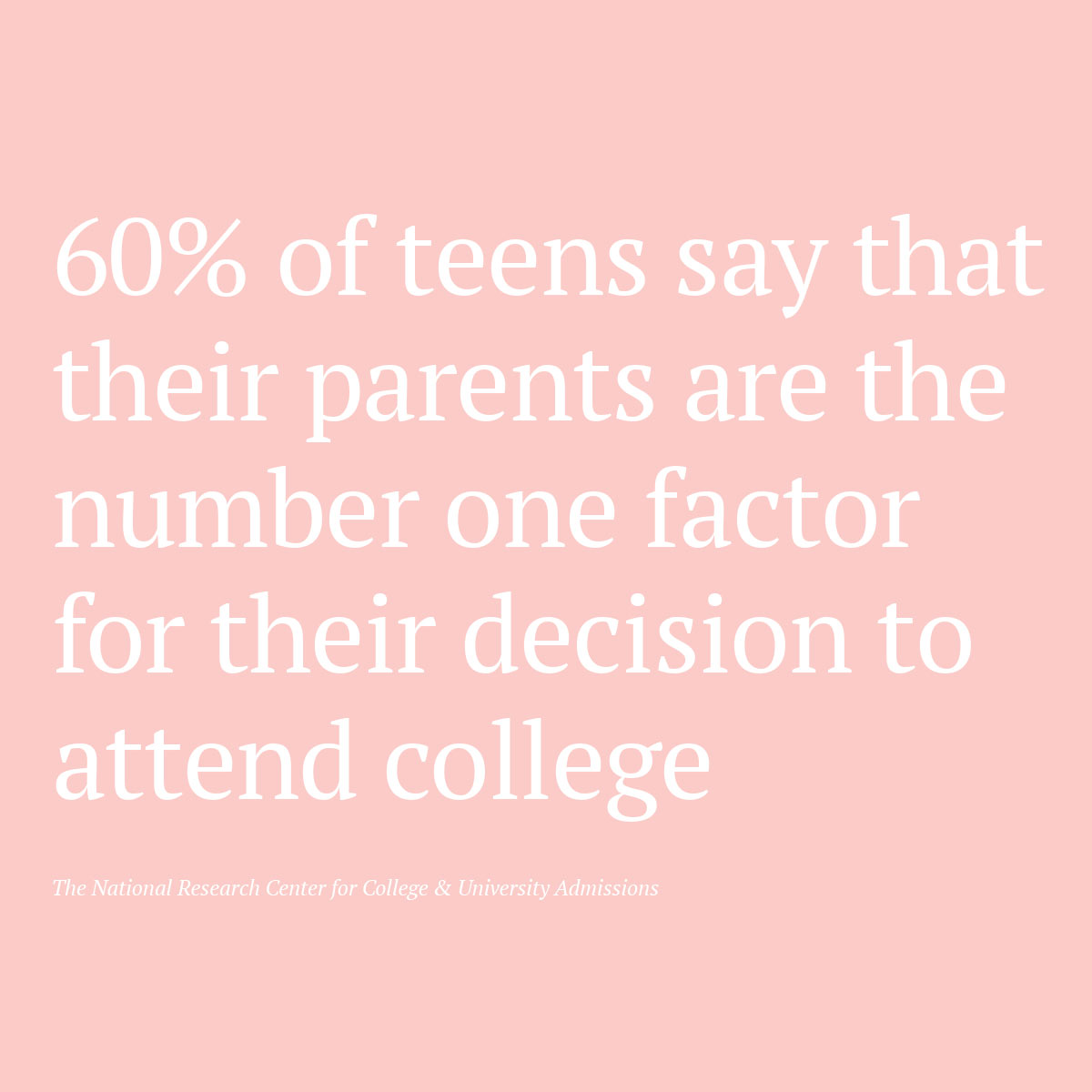
Parents maintain the primary influence for students, so understanding their needs and concerns is important to sustain student enrollment. After research, our team found that parents could not easily identify the benefits of the program, those benefits being successful alumna and design being taught in the context of business.

IDEATION: STAYING CURRENT AND PUTTING OUR BEST FORWARD
This concept stood on the basis of showing content that was relevant and up to date first, with older content below. Like a news site, the most recent information surrounding the program would be pulled and displayed.

MAKING IT MORE INTERESTING
Feedback that our team received from the first ideation was the lack of interest by our client. Although they liked the direction, they wanted to see more color and more interaction within the design. The result, a unique intersection of editorial style and interaction.

NEWS UPDATES ON THE GO
The site was built based on the research that what our audiences were looking for was to stay updated on the program. Because of this, the site was designed to feed in news updates of trips, events and awards that our students receive, as well as feeding in our social media accounts.

