Sweetland
Sophomore project
Spring 2020
Mallory Jarrett
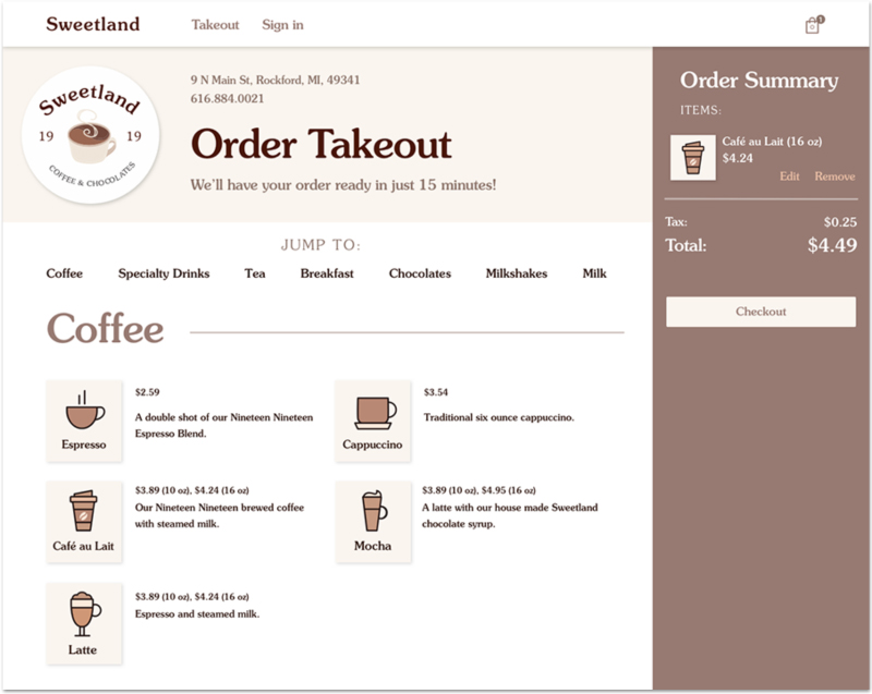
PROBLEM:
A local coffee shop risks losing business during times of mandatory shutdown. A fresh look can help draw customers in and make them want to buy the product and keep the business going.
GOAL:
Modify the current takeout process to support a positive user experience, and entice users to buy the product even in times of hardship.
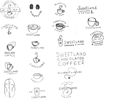
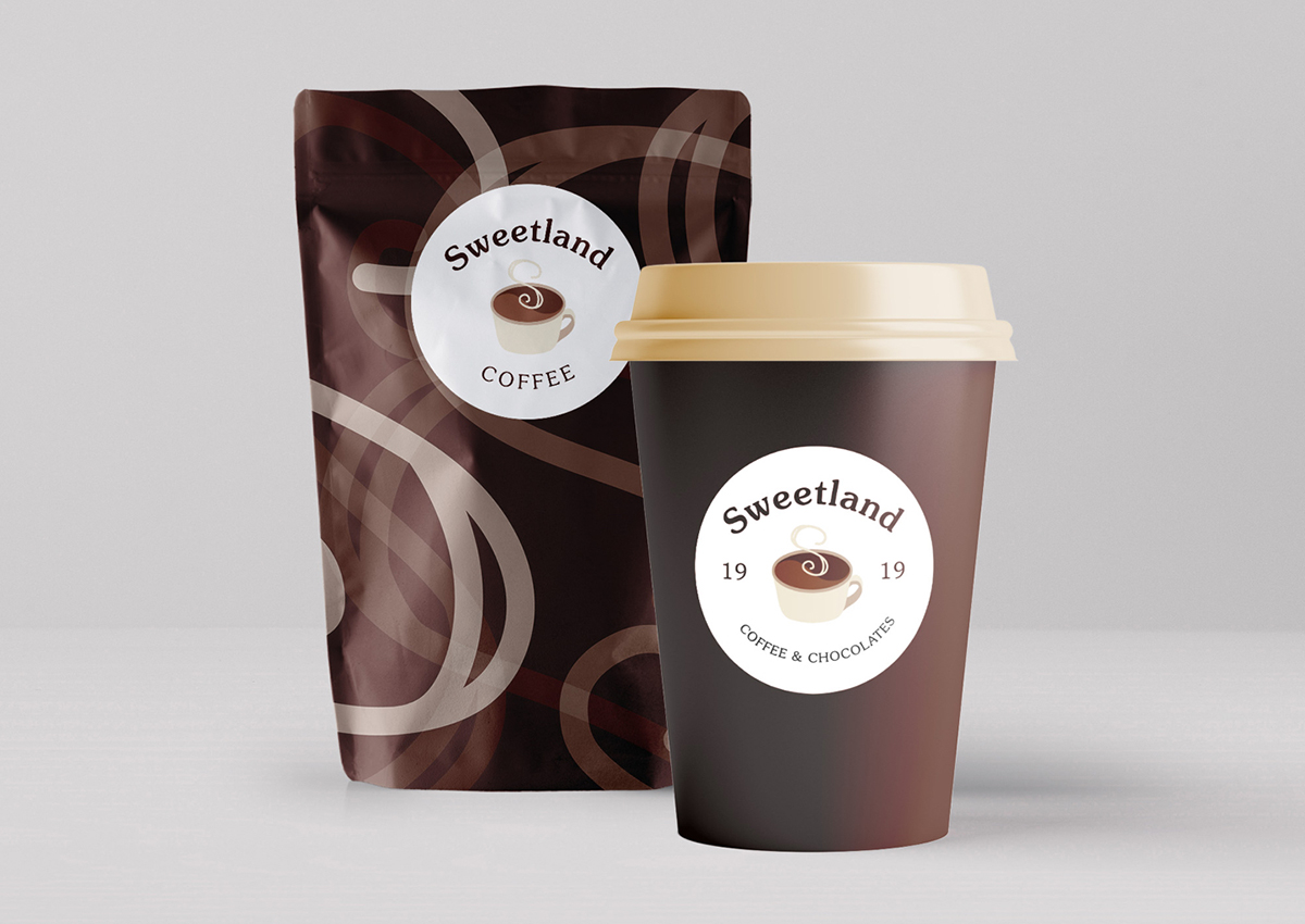
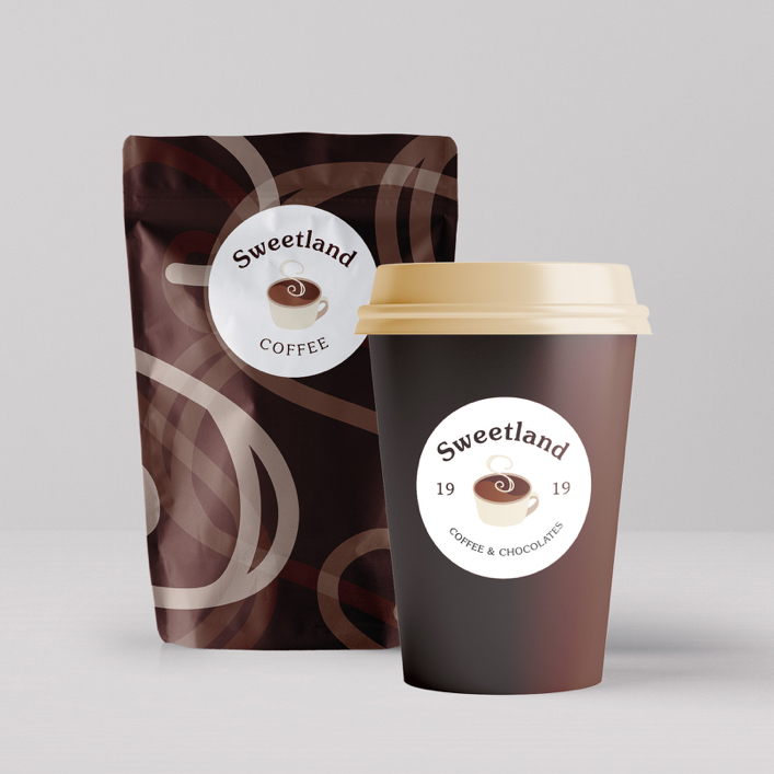
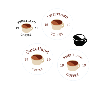 The brand has to reflect the shop’s environment: warm, comfort, homemade, cozy, and friendly. The warm brown tones fit these traits and the product.
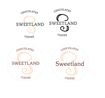
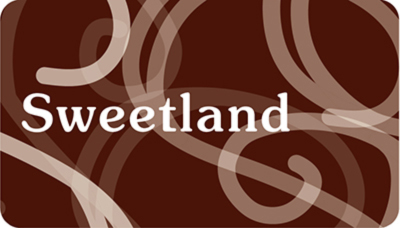
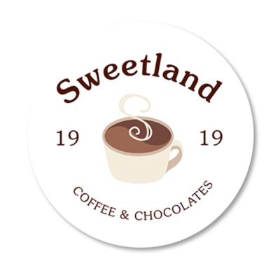 The chosen design features a relaxed-looking typeface that communicates softness and warmth. The “s” shape of the steam could be used as a graphic identity itself.
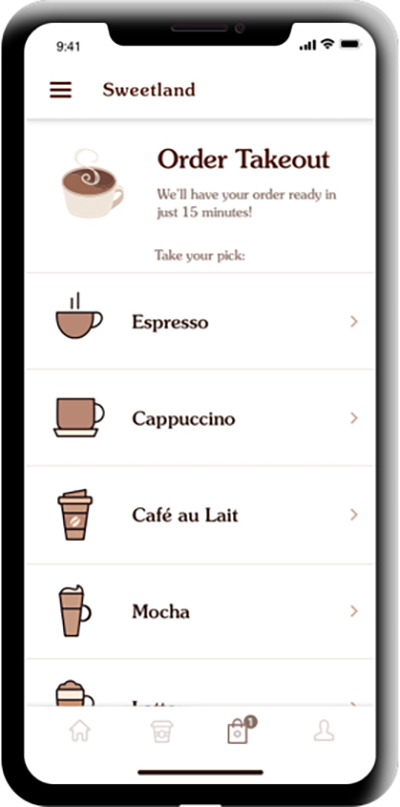
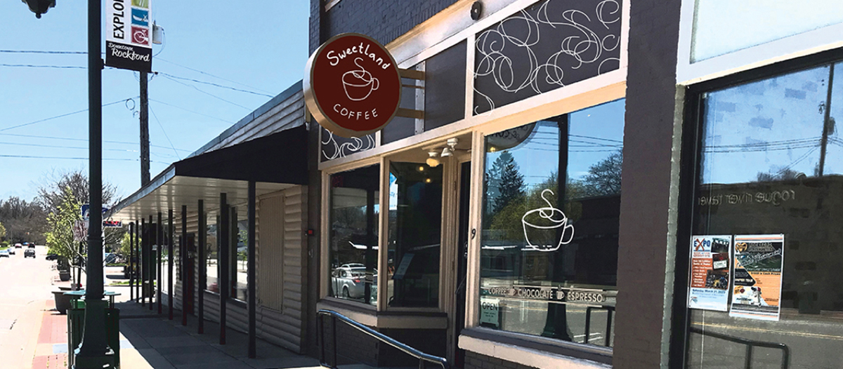 A real-world example of what the storefront could look like with the branding update.
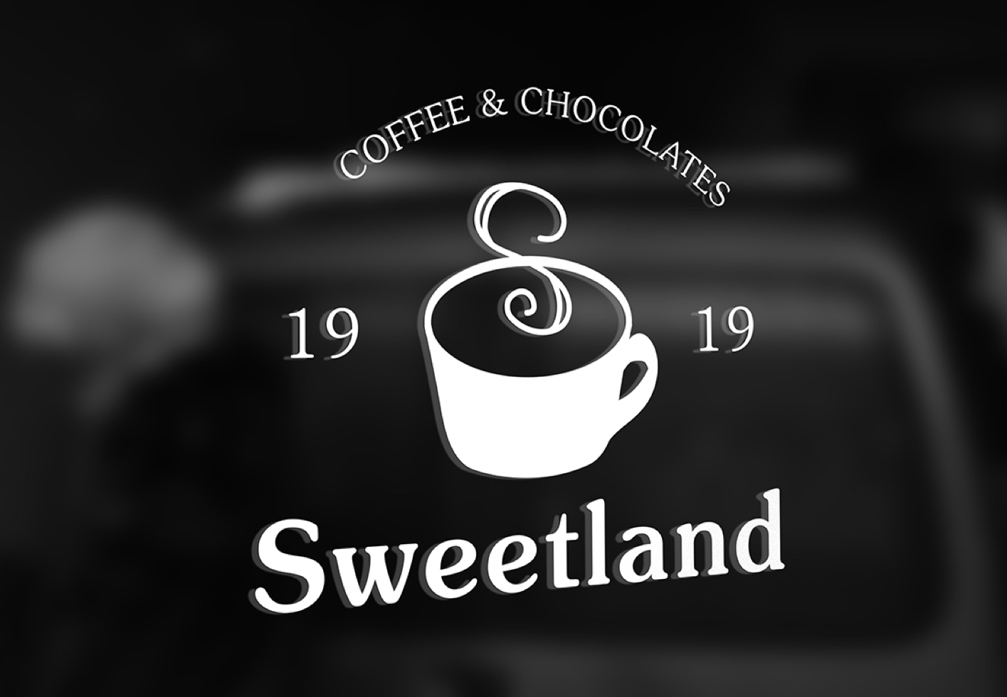
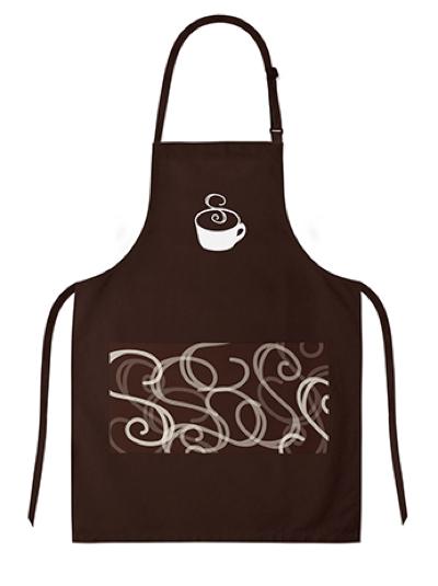 Employee apron
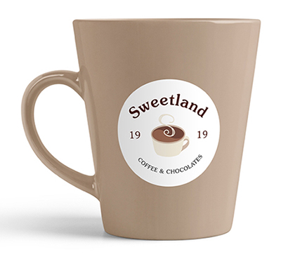
 Customers can also purchase a mug or gift card to further support the business and encourage others to do the same.