Southwest Airlines Experience
Junior project
Spring 2019
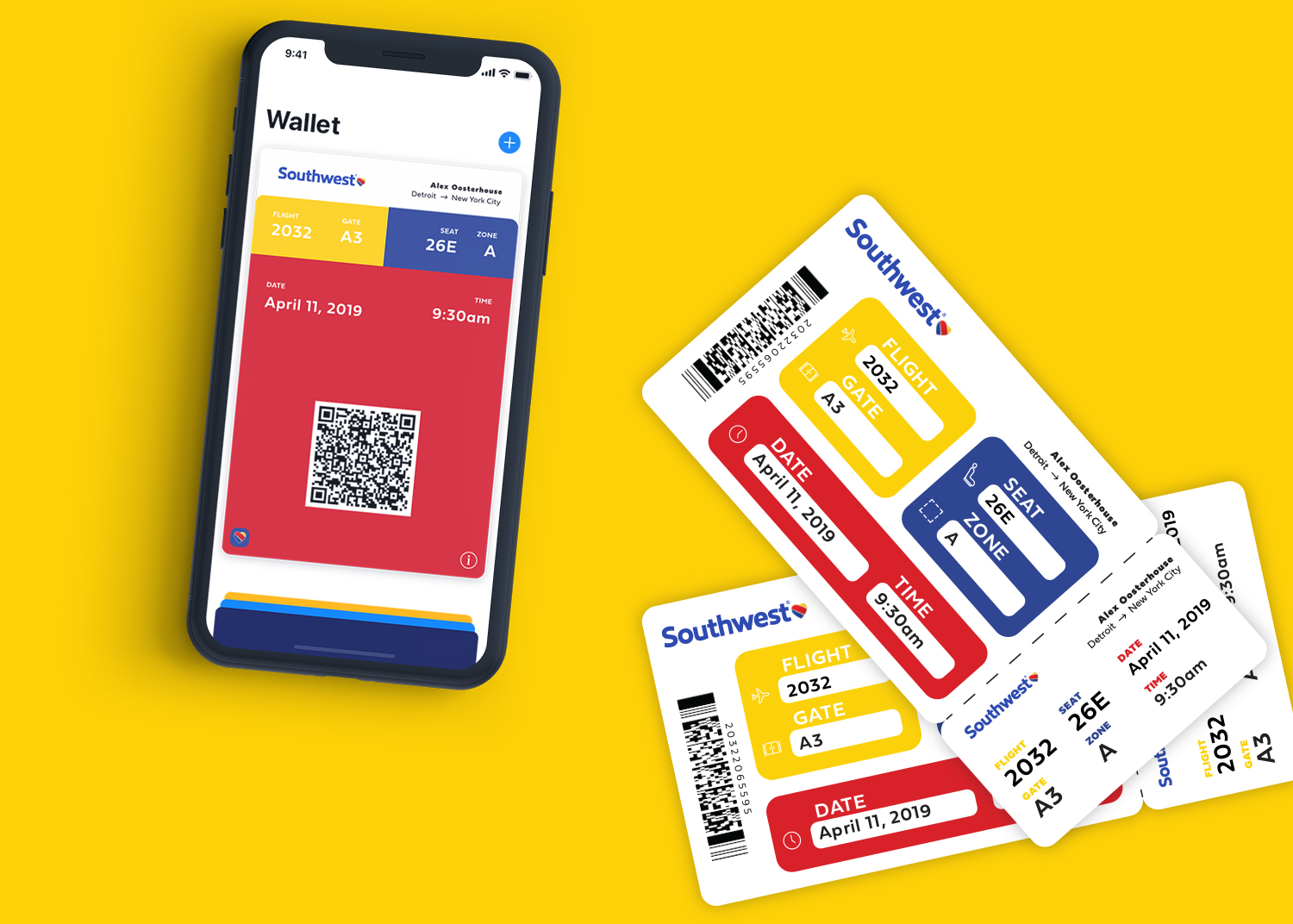
I redesigned Southwest’s physical boarding pass. Even though Southwest offers a digital boarding pass within their app, many users still rely on the physical pass.
Current Problems: Difficult to Read, Awkwardly Shaped, No Brand Standards
![]()
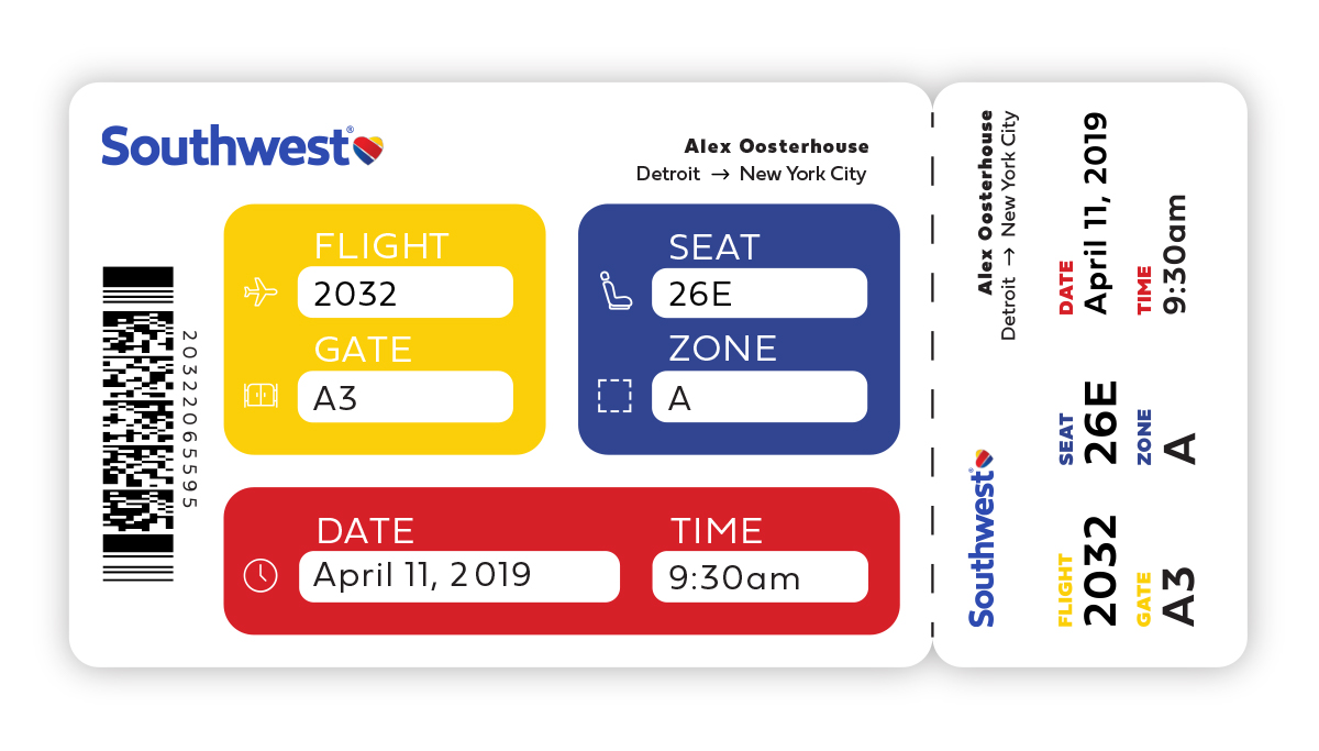
The pass has been stripped away of any information that is not relevant to the user. This makes it much easier to understand.
![]()
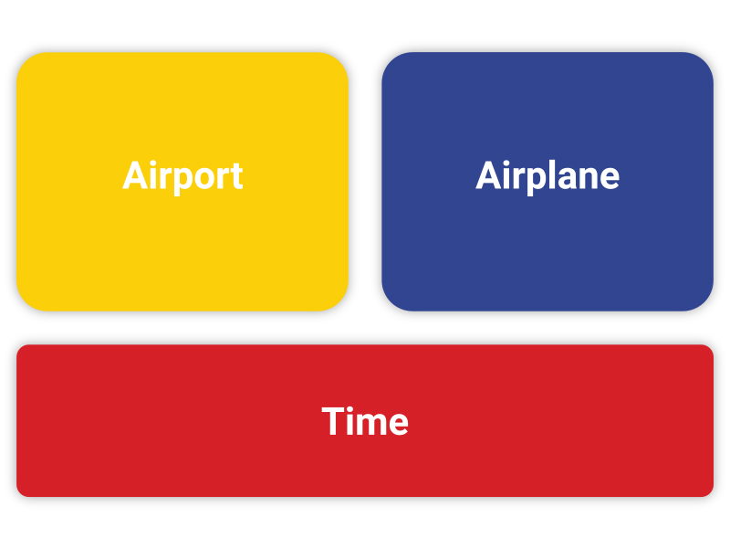
The information on the boarding pass is split up into three color groups: airport, airplane, and time. The colors match up with signage in the airport that covers the same subject.
![]()
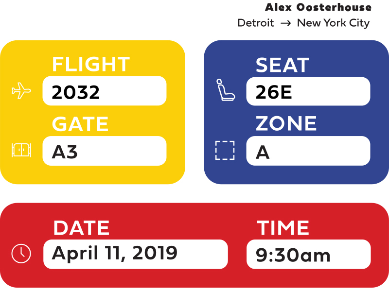
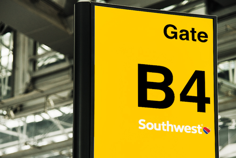
Yellow is used for navigating the airport. The physical departure gate is yellow so users can easily make the connection from their pass to the gate.
![]()
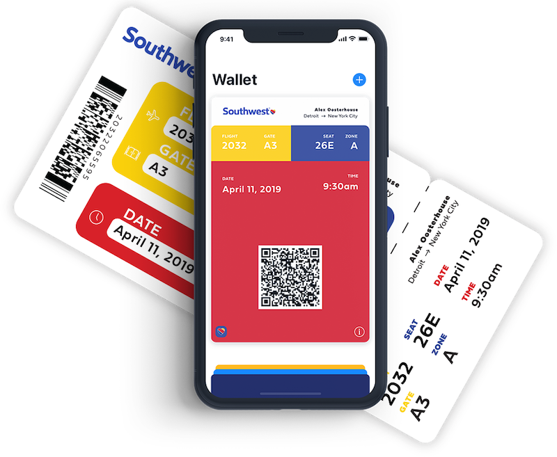
The color system also extends to the mobile boarding pass. This creates a cohesive experience no matter what form of pass the user uses.
![]()
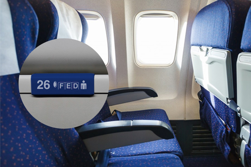
Red is used for time. It covers the date of the flight and its time of departure. Red is used for clocks and signage that are concerned with departure.
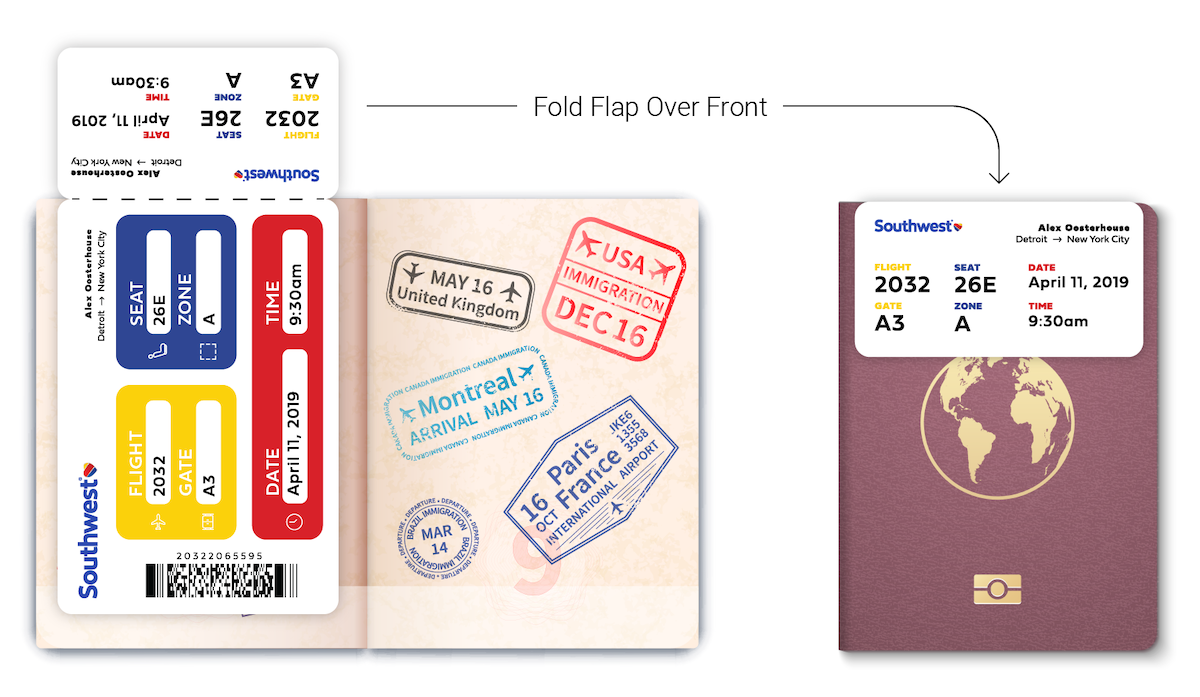
Fits In A Passport
![]()
The color system also extends to the mobile boarding pass. This creates a cohesive experience no matter what form of pass the user uses.