
Short and Stout
Sophomore project
Spring 2020
Brooke Martin
Short and Stout products stand apart from the crowd because they are designed and created by local artisans, not in a factory in another country.
Short and Stout special-tea shop needed an identity to connect with quirky customers who appreciate products outside the ordinary. Unique products from tea pots to aprons, and copy will help them stand apart from corporate competition.
 The logo and wordmark are handcrafted and unique like the teapots they sell. The serif typeface sits comfortably together like a warm brew on a cozy day. The logo is bold and stands out.
 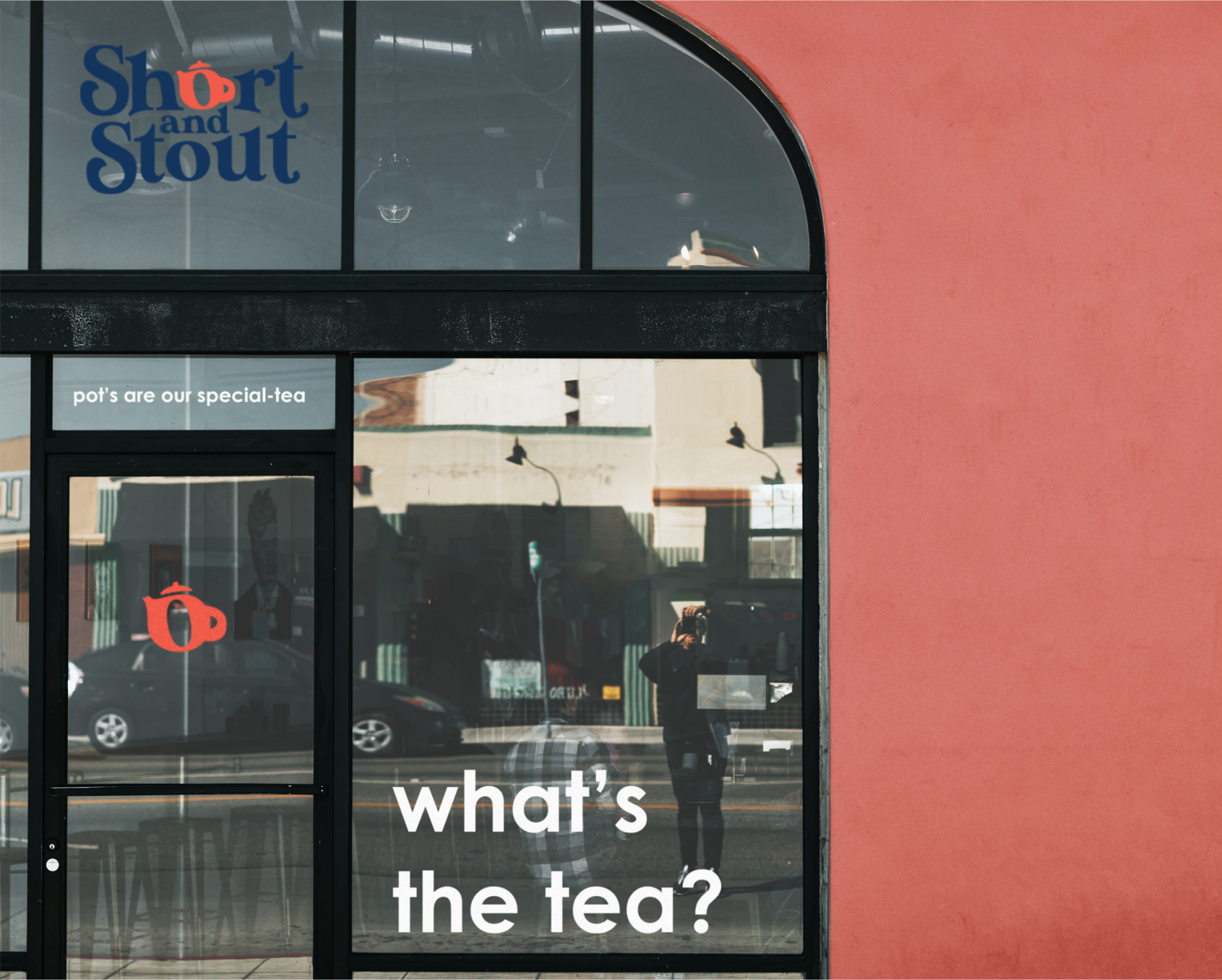 The store would help customers experience their tea pot in an eclectic boutique environment in Boston.
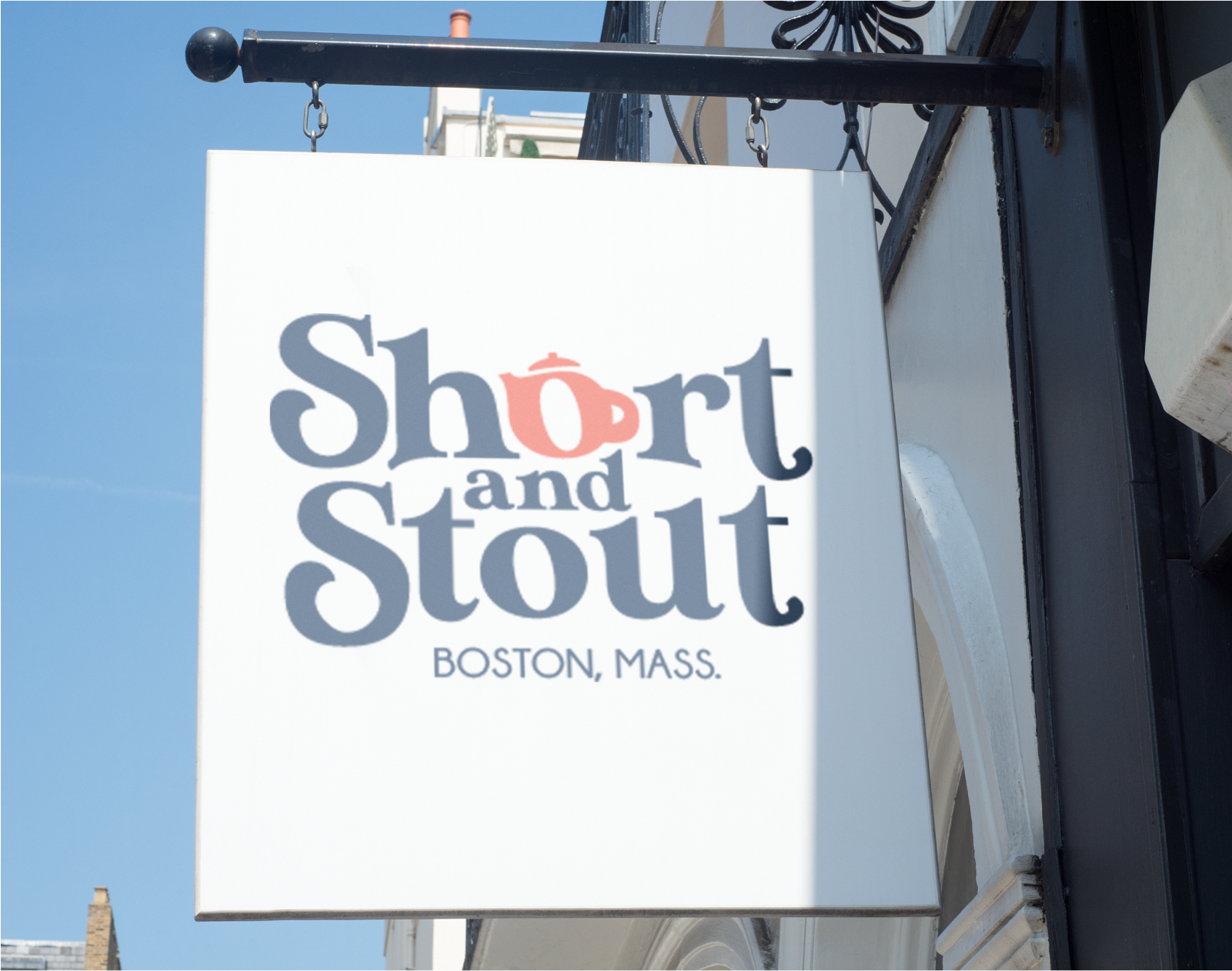
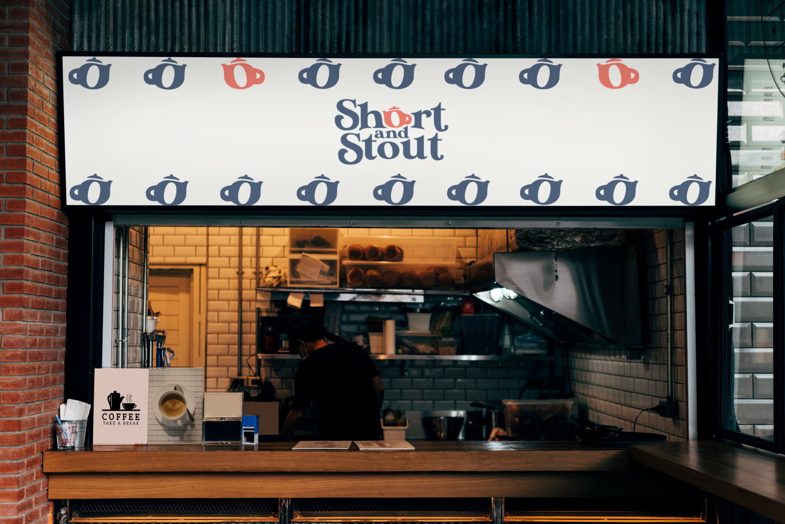 Short and Stout’s entire store experience emphasizes embracing what makes you unique, all the way to the style of Short and Stout’s tea-baristas.
 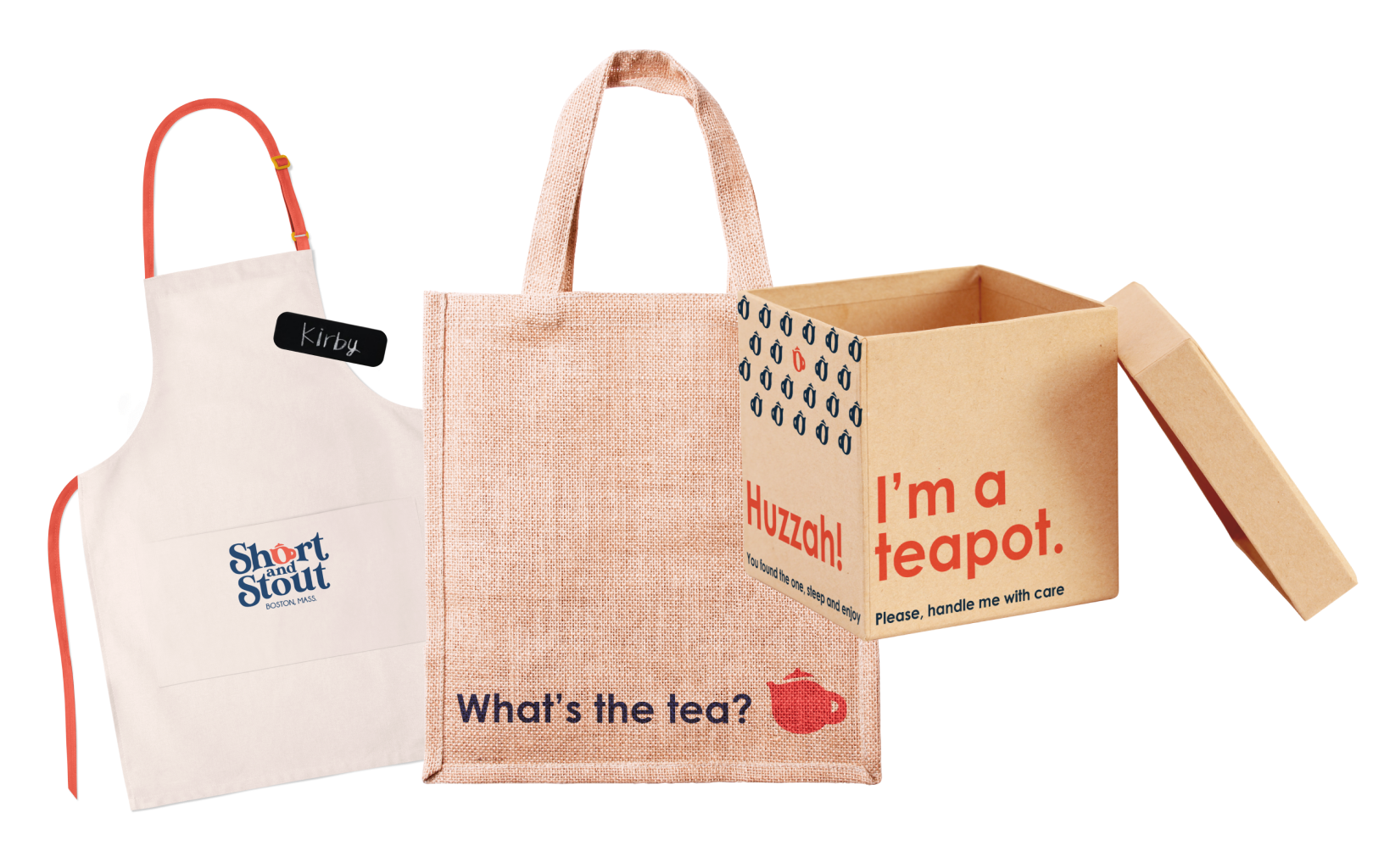 The recycled packaging features quirky phrases and celebrations for the customer who found their unique tea pots.
 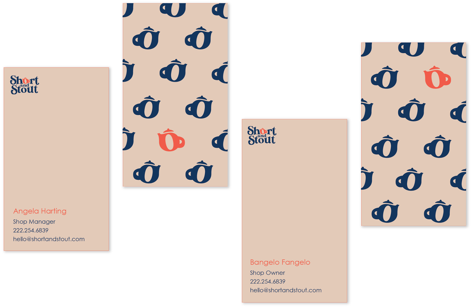 The Short and Stout brand pattern emphasizes the value of finding your unique tea pot.
