Pringles® Packaging Redesign
Junior project
Fall 2021
Dylan Bowden, Hannah Stites, Katie Fodor
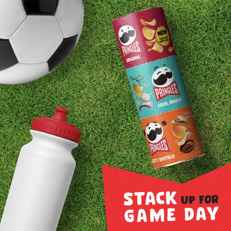
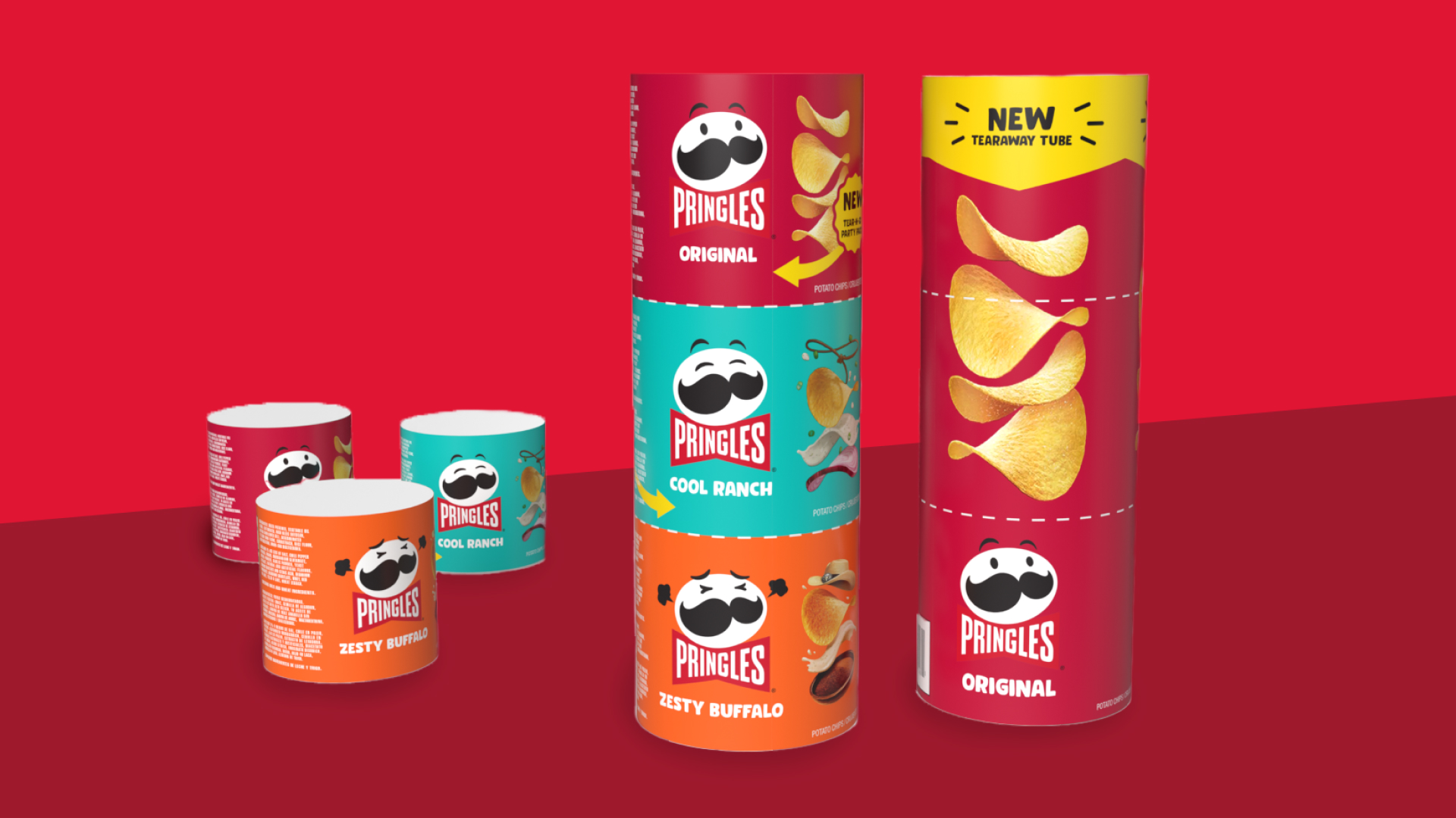
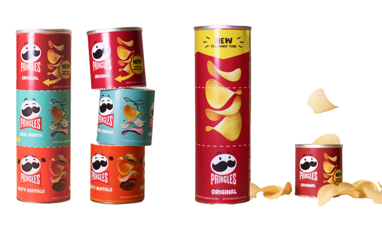
In a group, our team was able to redesign and prototype the Pringles can to be more usable and appealing for users.
Packaging, UX

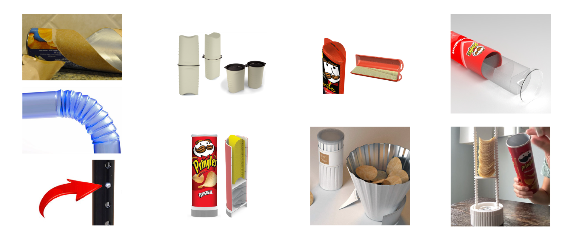
 As a group, we began sketching out our thoughts. We then narrowed down our brainstorm into three main ideas and sent out a survey asking users their preferences.
  Although it got second place in our survey, we still wanted to explore a collapsible tube.
The first prototype was a “twist tube”that would fold in on itself and shrink down to a more manageable size. We used poster board and matte board for this prototype and laser-printed it with help from our PDET partner, Katie.
 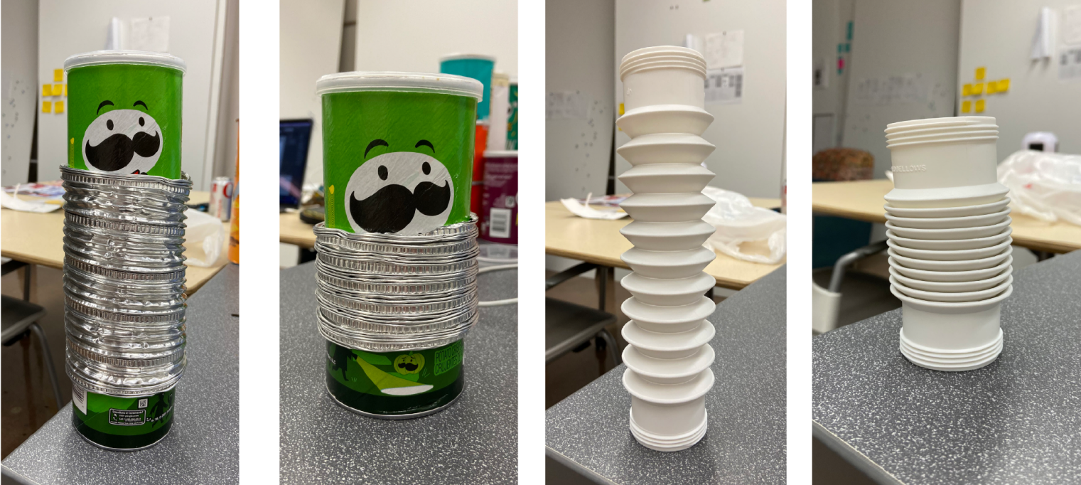 Our second prototype involved replacing the center of the tube with a collapsible material. These prototypes were created with supplies including retractable ducting and plastic tubing similar to that of a bendy straw.
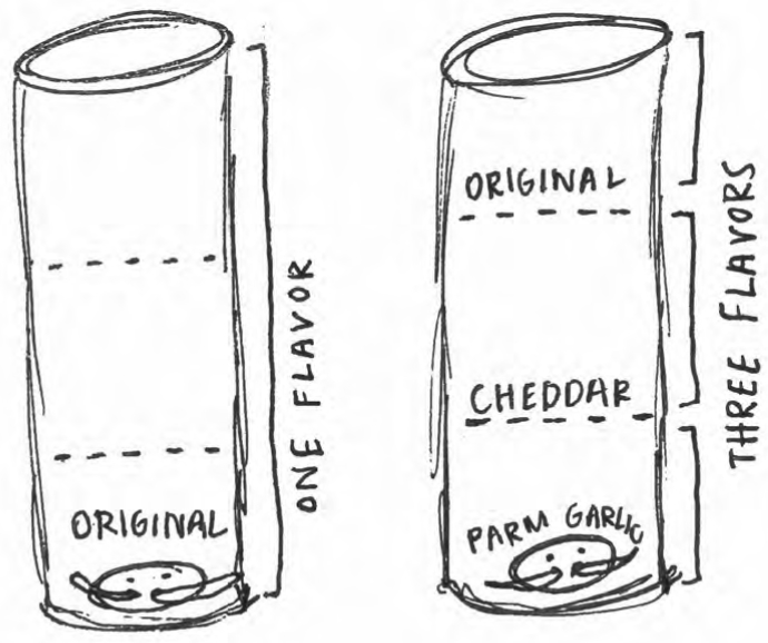
 With the perforated tube in mind, we had to find a way for the lid to fit to the inside of the tube rather than grip onto the outside. We used poster tube caps as reference, and our partner Katie whipped up a CAD model of the new cap as well as 3D printed it for us.
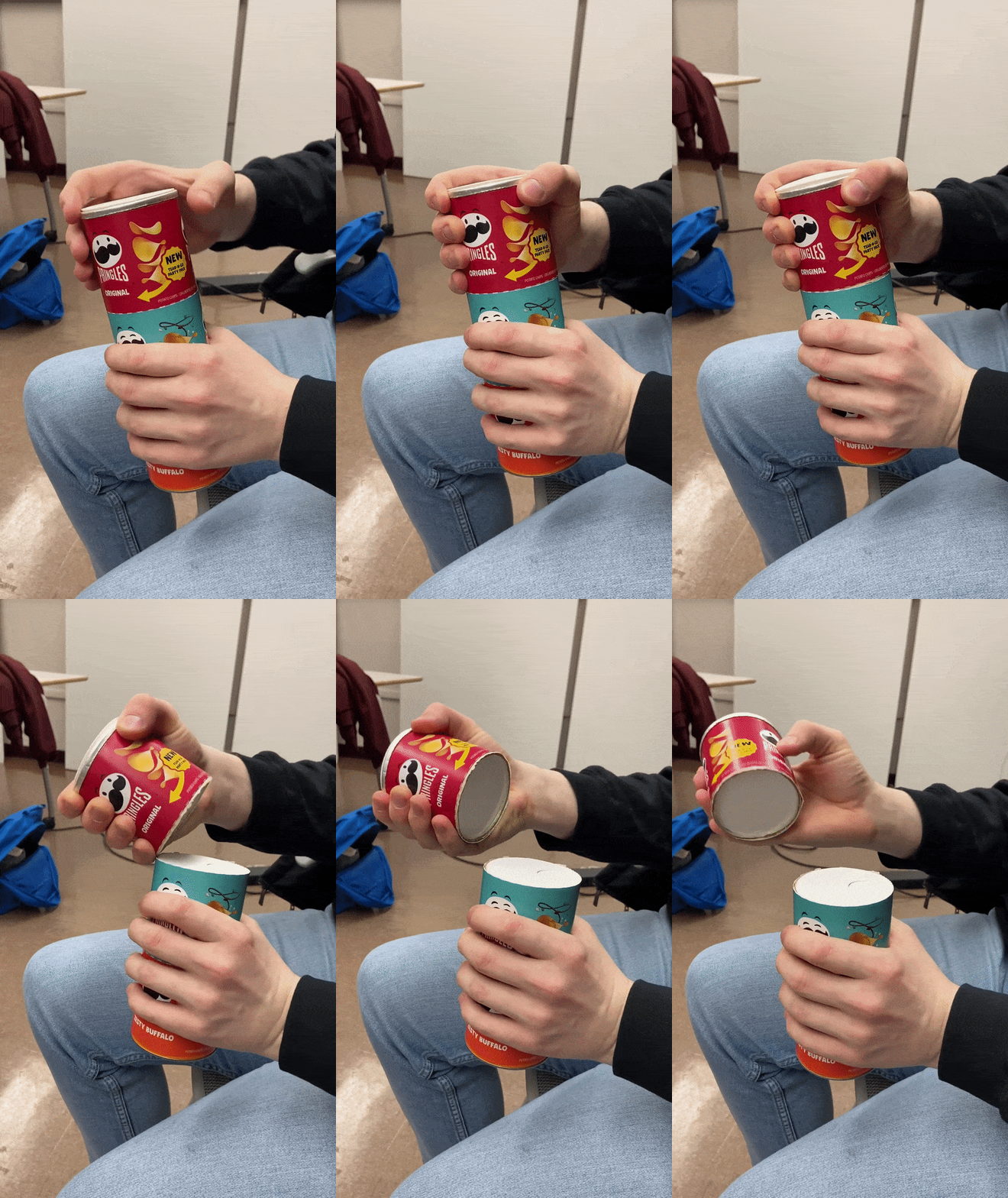
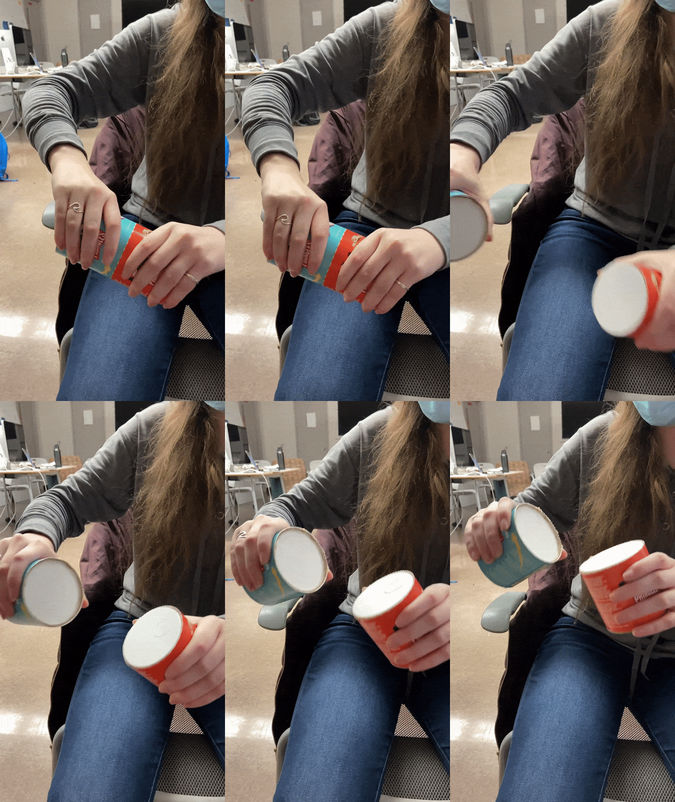
 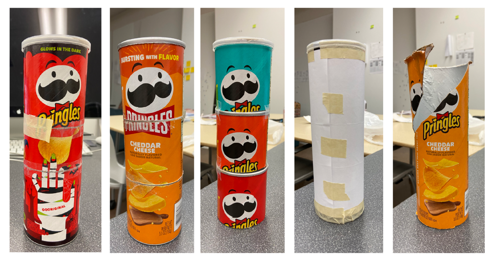 We began to prototype how we would pull off the perforated tube. We tried tons of different ideas and ultimately found our final iteration that we could put a label on and test.
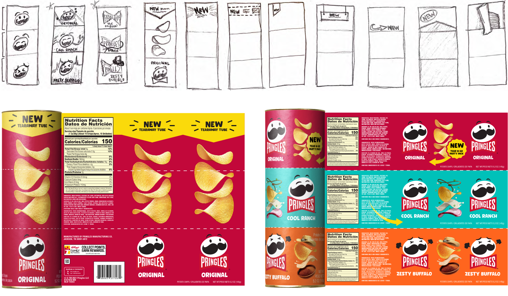
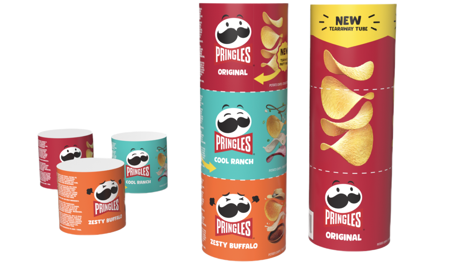

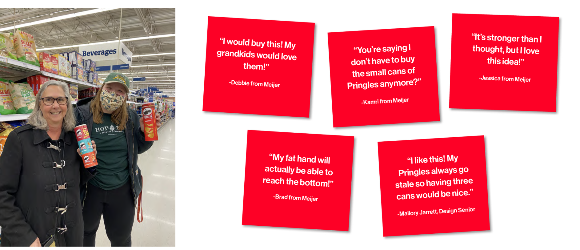 We also took our prototypes to the store where they could be handled by actual users and received lots of positive feedback about our design.