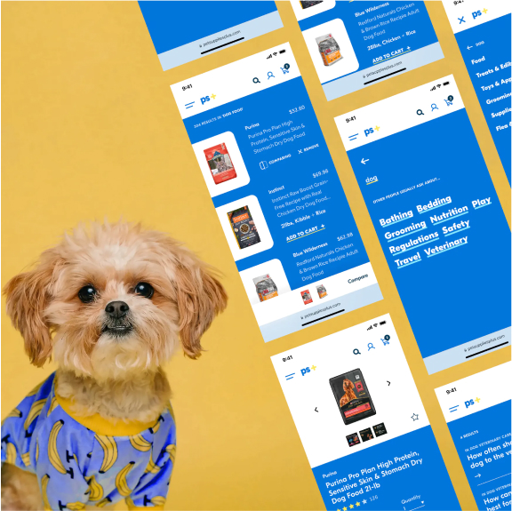
Breathing new life into a pet retailer’s eCommerce experience
Junior project
Spring 2019
Online pet retailers boomed in the opening months of COVID-19 in the search for companionship. I designed and built a refined e-commerce experience to bring the new brand to life.
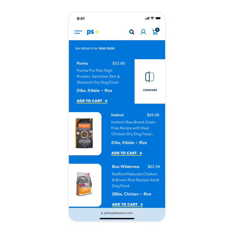 New pet owners relied on comparing products to understand what was best for their new friend. A slide gesture revealed the ability to compare without getting in the way of more criticla information like price and weight.
 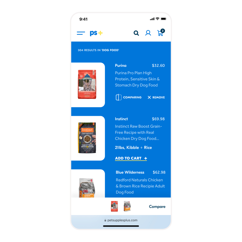 A small bottom bar captured any products in queue to be compared without taking up too much room to view products
 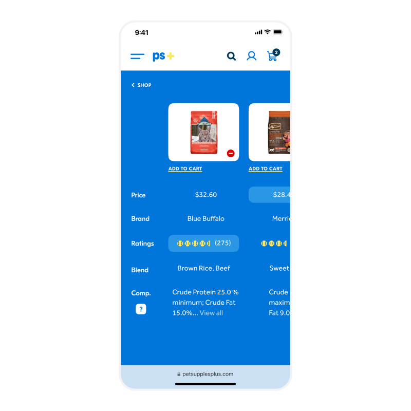 A compare table presented each piece of information side by side, highlighting advantageous differences. Lesser known differences, like food composition had tooltips built in to help users understand their significance.
 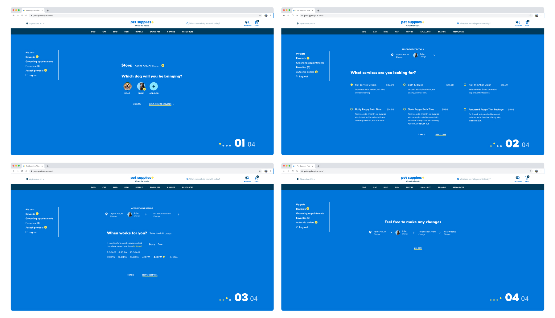 More seasoned pet owners who relied on Pet Supplies Plus’ services were often frustrated with how clunky the process felt, especially for more than one pet. A multi-pet enabled version was cleaner and much quicker to schedule when in a hurry.
 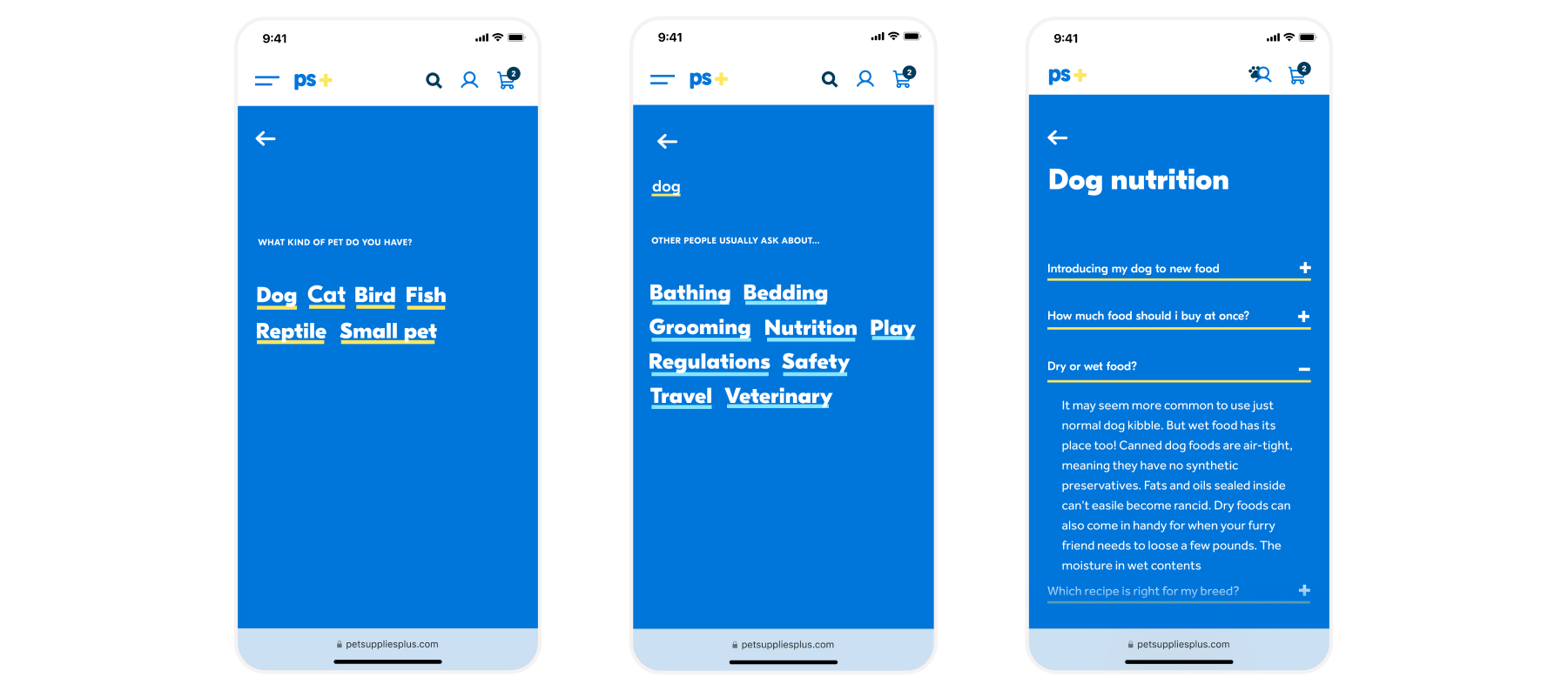 New pet owners didn’t want to just shop for products, they wanted to understand how to best take care of their pet. A keyword-based FAQ system helped narrow down what they were looking for.
