

Frustration-free course registration
Sophomore project
Fall 2019
Nathan Nye
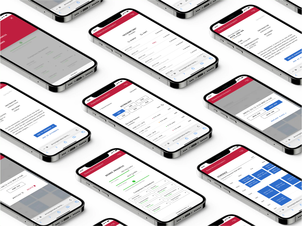
Ferris State students expereienced frustration and anxiety when registering for courses. By talking with students and advisors, I developed a new webapp to help students feel more confident in their upcoming schedule
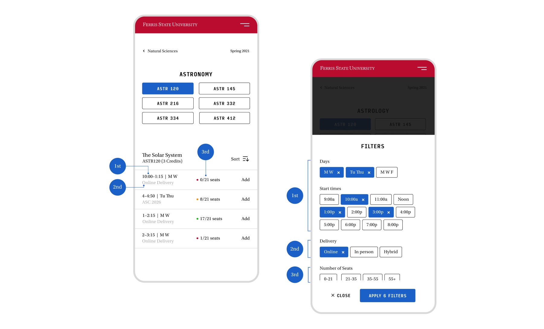 Card sorting exercises let students determine the hierarchy of course information. The app mirrored when students wanted to see specific information on a course.
 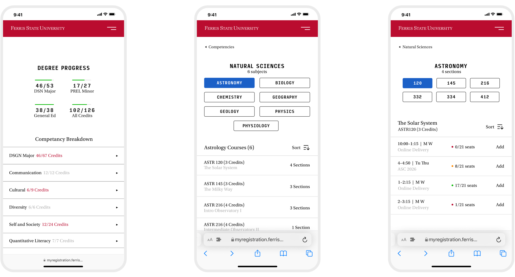 By displaying courses with names users understood, they stopped having to guess at a wall of acronyms and found courses much quicker.
 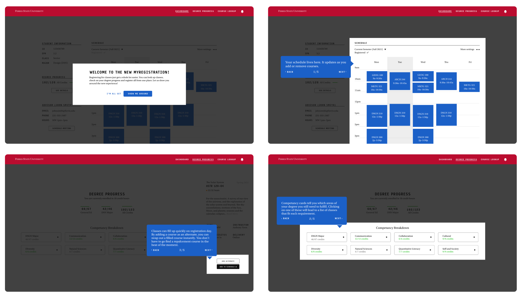 An onboarding flow was critical in making students proficient with an all new process, and helped save the time of advisors.
 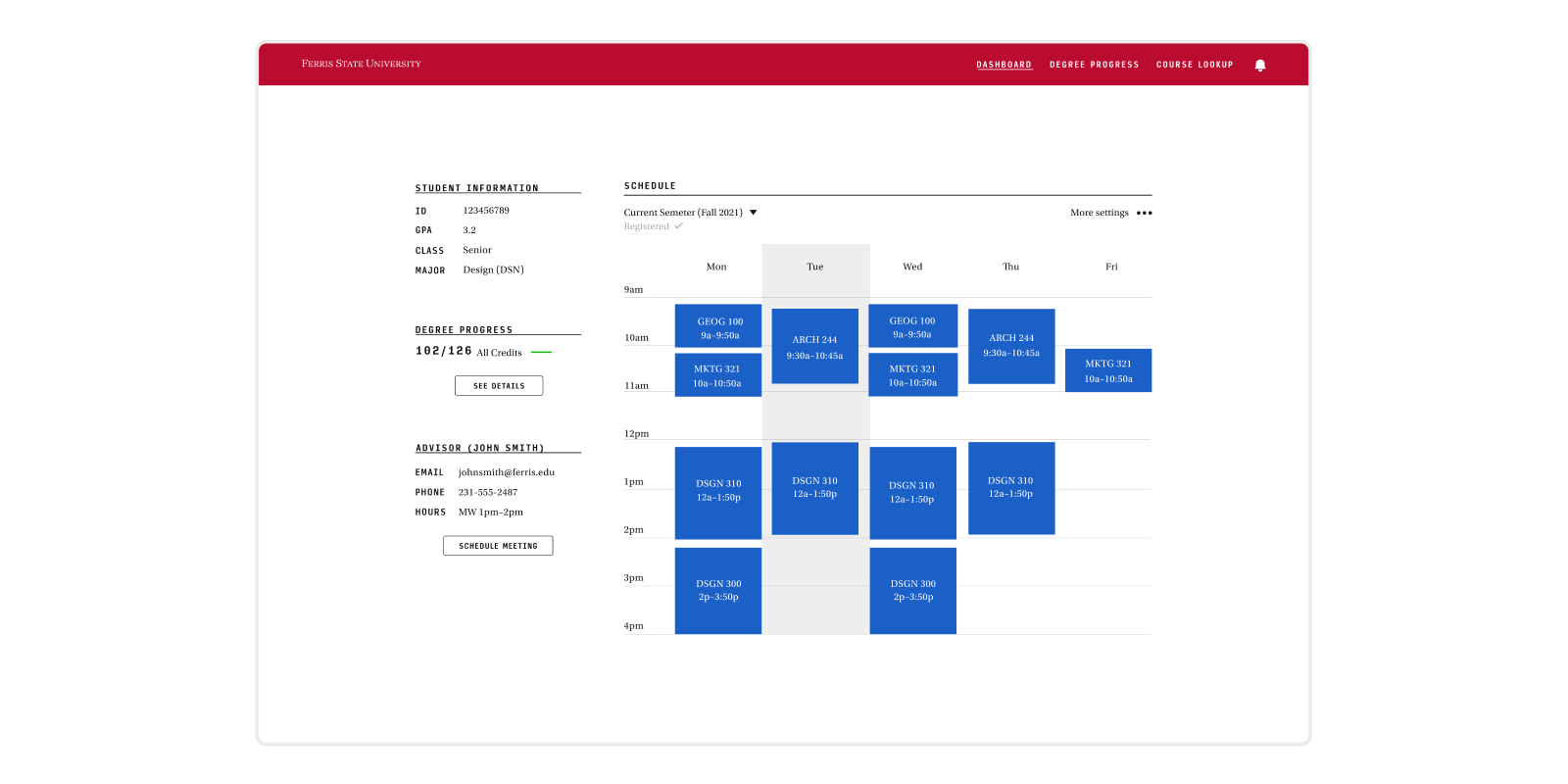 Students were frustrated having to bounce between Word docs, spreadsheets, and browsers to map out a schedule. A weekly view kept everything in one spot.
 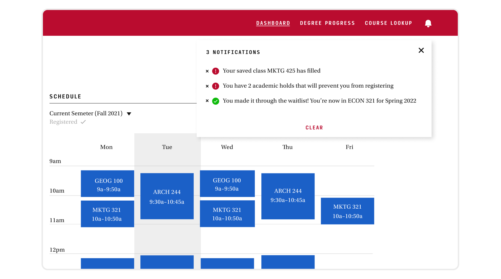 Colors followed brand guidelines. But the dominant red could only be used for error and danger states. Too frequent and users would be desensitized to errors.
 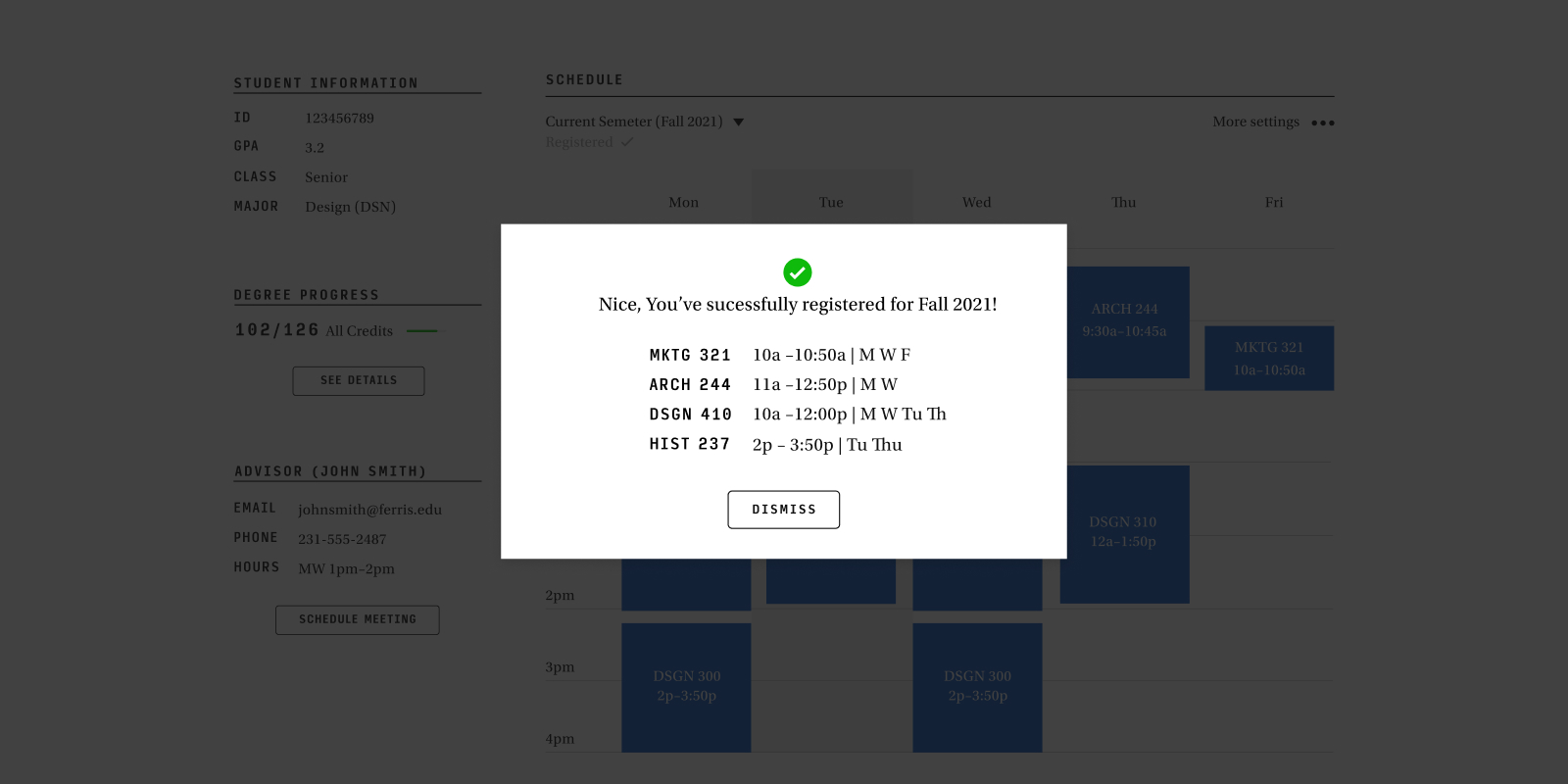 Without a confirmation message after submitting classes, students were worried their request hadn’t gone through. A small notification at the end helped ease the anxiety after completion.